Simple Grid Logo

Simple Grid

Simple Grid is a responsive, lightweight, and easy-to-use 12-column CSS grid system designed to help you quickly build responsive websites. It supports mobile-first design, with classes to control column widths across different screen sizes. The system includes a container with a max width of 960px, rows, and columns that you can easily customize. It also offers an SCSS version for SASS users and uses Lato from Google Fonts for typography styling. Suitable for developers of all skill levels looking for a simple, performant grid solution.

platform:web pricing:free form:library form:css-framework feature:responsive feature:lightweight feature:mobile-first feature:sass-support feature:google-fonts target:developers use-case:web-design

Features

Responsive
Lightweight
Mobile First
Sass Support
Google Fonts

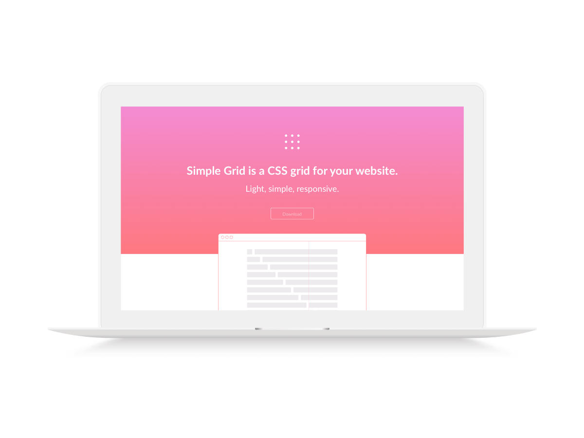
Images & Screenshots

Simple Grid Image
Simple Grid Image

Testimonies

No testimonies available for this tool yet.

Basic Info
  • Category Design Tools
Availability & Pricing
  • Pricing Model
    Free
AI Curation
  • Curator Agent updated description, category, subcategory, and 3 more fields for this tool

    10 months ago

Similar Tools